- Client
- Sable Café
- Industry
- Hospitality · Coffeehouse
- Service
- Brand Identity Kit
- Scope
- Brand Identity · Logo Design · Typography · Colour System · Packaging Direction · Café Collateral · Visual Identity
Sable Café was imagined as a coffeehouse built around ritual rather than routine. Every design decision was intended to evoke warmth, craftsmanship and the quiet comfort of lingering over a well-made cup.
The resulting identity combines expressive typography, roasted-earth colour and tactile applications to create a café brand that feels timeless, welcoming and deeply atmospheric.
Coffee, ritual and conversation
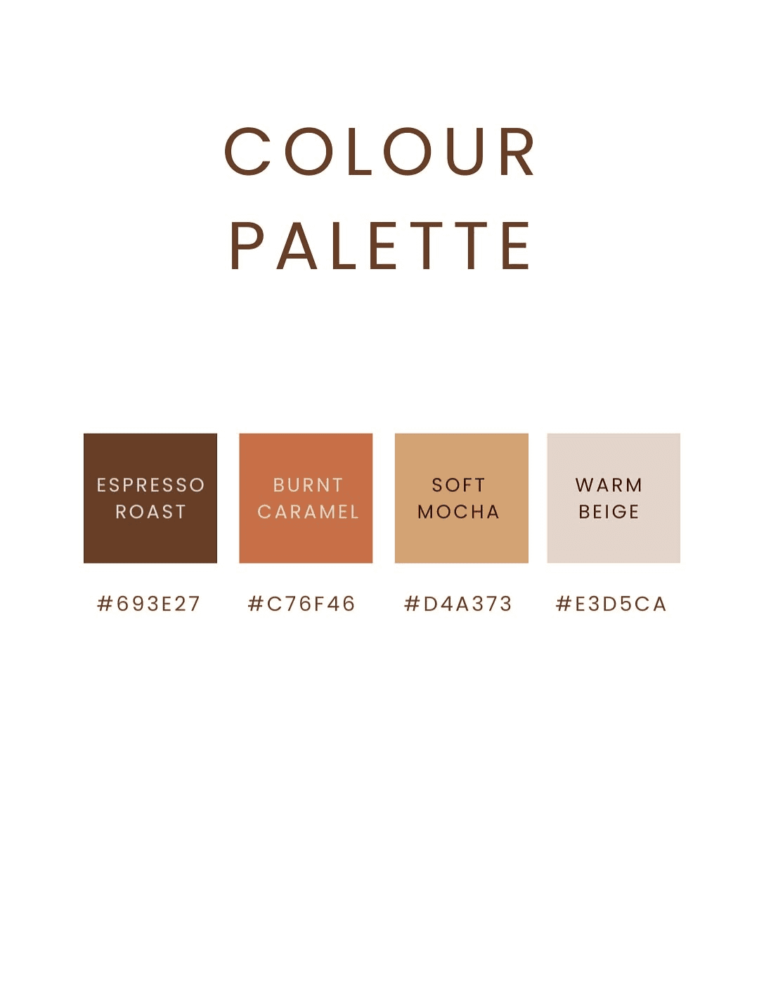
The visual language draws from roasted coffee beans, warm ceramics, early morning light and the slow rhythm of neighbourhood cafés.
Rich browns, soft caramel and restrained typography create an identity that feels handcrafted without becoming nostalgic.
A mark shaped by warmth.
The wordmark balances expressive serif forms with restrained geometry, creating a signature that feels both contemporary and timeless.
Roasted earth, expressive type.
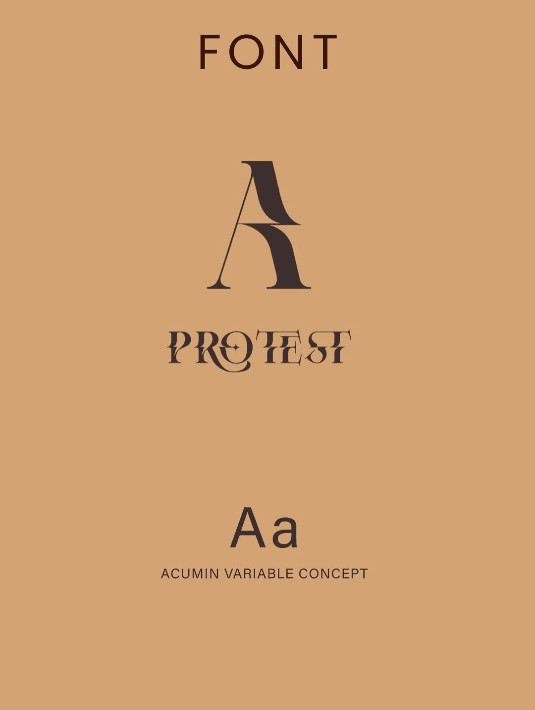
- Primary Typeface
- Protest
- Secondary Typeface
- Acumin Variable Concept
A premium café lookbook.
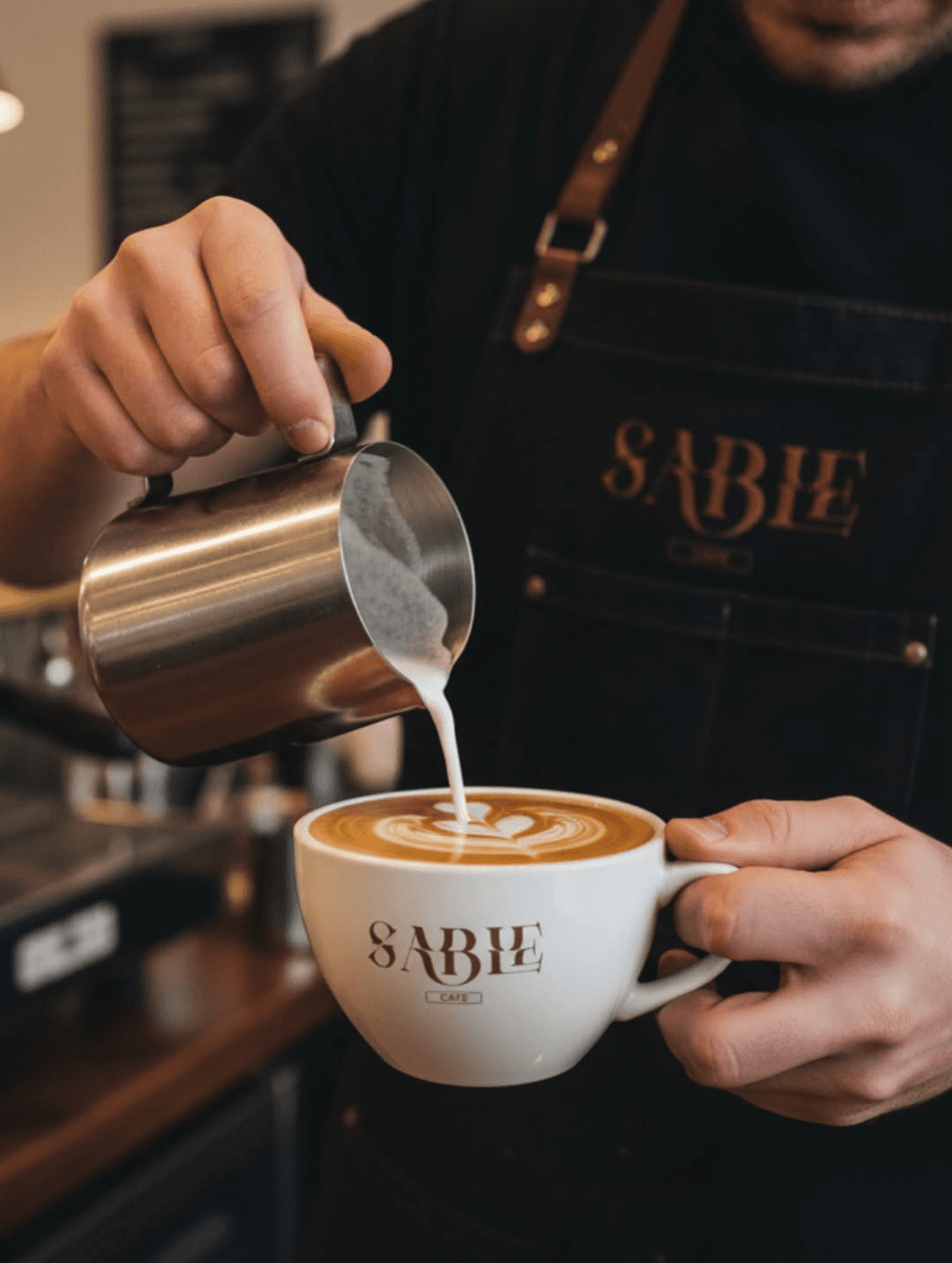
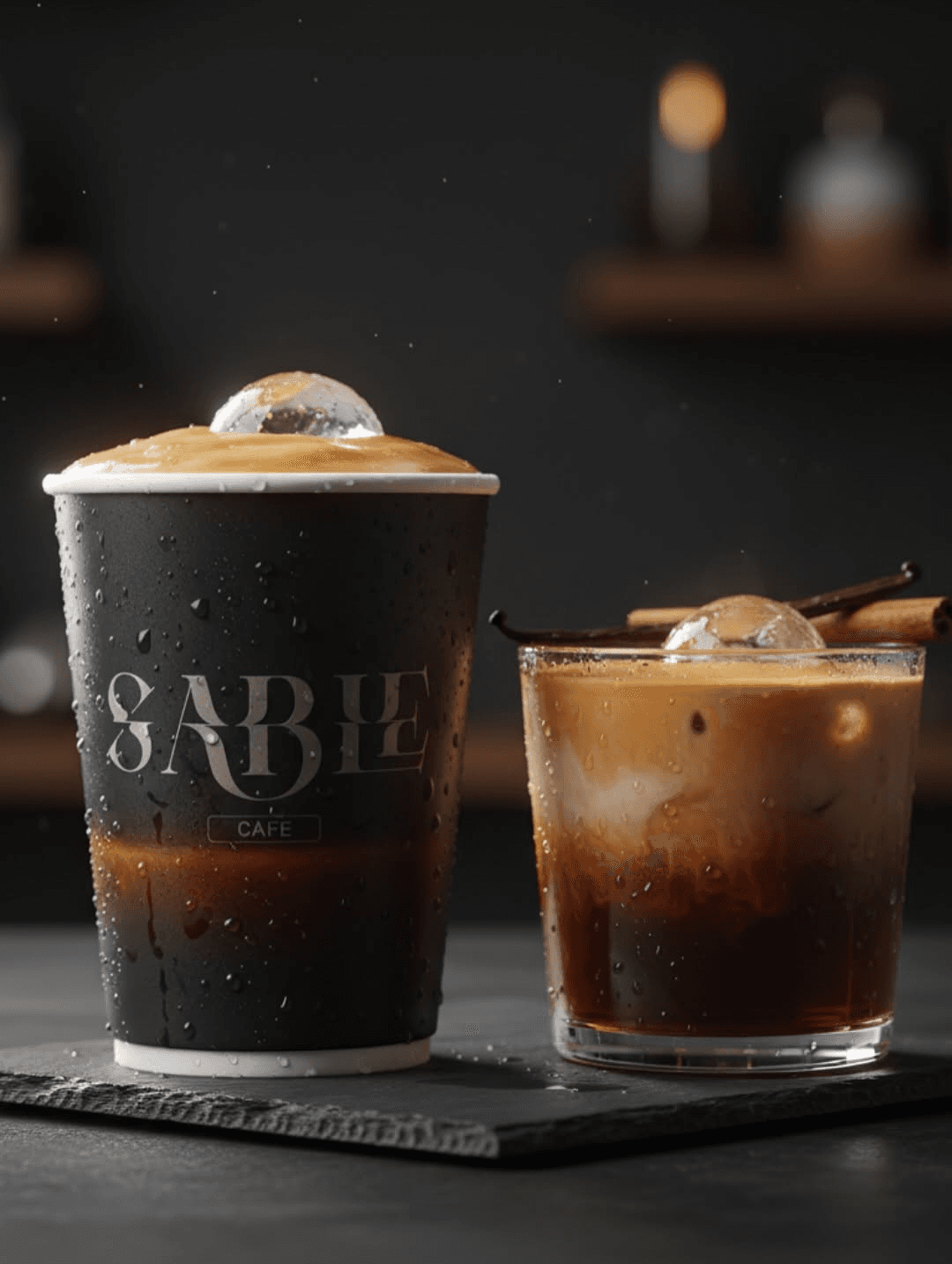
Designed for slower moments
A visual identity built around warmth, craftsmanship and everyday rituals, allowing the brand to move naturally between packaging, café interiors and product photography.
More than a café identity, Sable was designed as an atmosphere people remember long after the final sip.